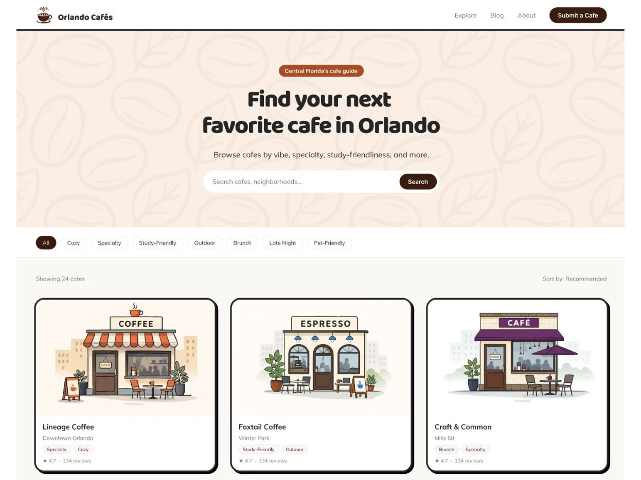
Central Florida Cafe Directory
OUTCOME
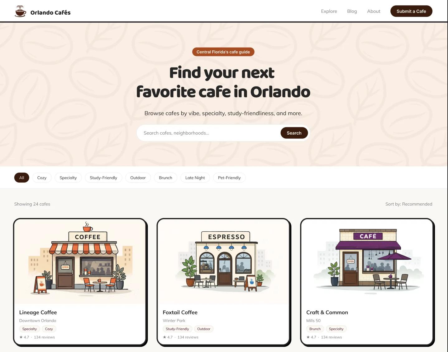
Transformed a text-heavy directory into a fast, scannable experience that lets users decide if a cafe fits their needs in seconds instead of reading through paragraphs.
FEATURES
Bento layout, at-a-glance cards, visual signals, noise bars, seating tags, quick scan UI
Reframed long-form descriptions into structured, visual content that supports decision-making. Reviews became supportive context rather than the primary source of information, while key attributes like vibe, specialties, and work-friendliness were elevated through tags, imagery, and modular components. This shift reduced cognitive load and aligned the experience with how users naturally scan and evaluate cafes in real life.
View the Live Website: OrlandoCafes.com
Designing for Decisions, Not Reading
Orlando Cafés Directory
A personal guide to every cafe I’ve visited across Central Florida. Built solo as a passion project, and a sandbox for rethinking how dense product UIs can drive quick, confident decisions.
Too much reading, not enough clarity
The original experience required users to read through dense text to understand if a cafe fit their needs.
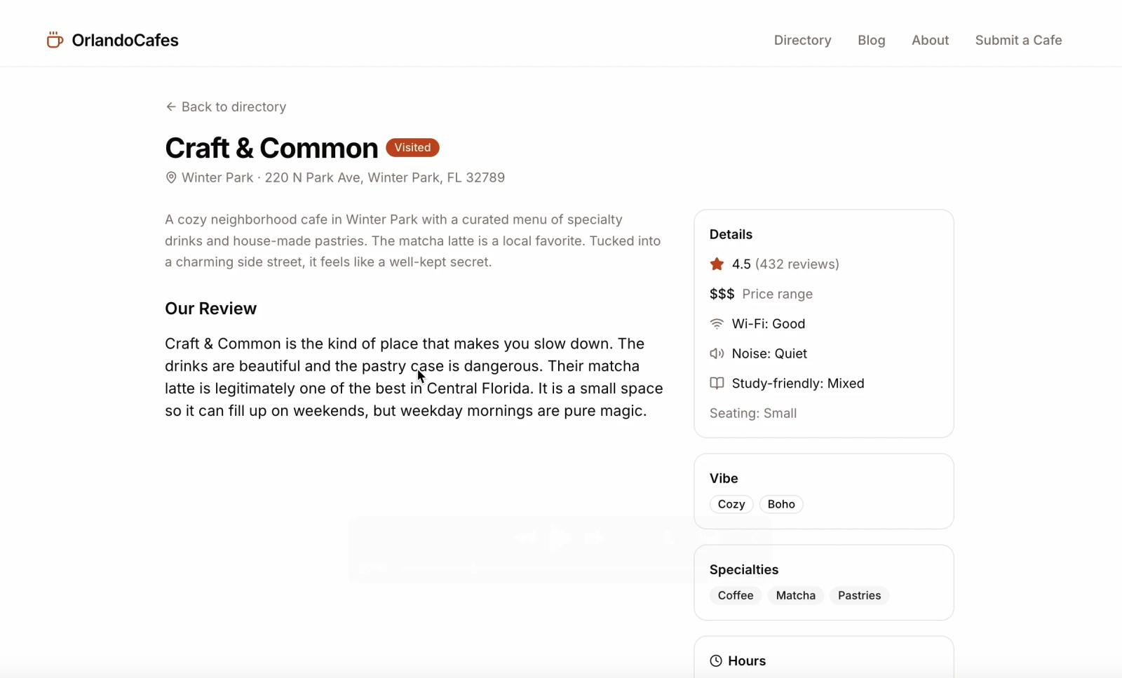
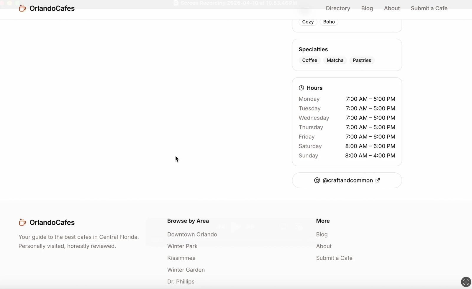
- Long paragraphs buried key decision info
- No clear hierarchy of what matters (noise, seating, wifi)
- Hard to compare cafes quickly
- Slowed down decision-making
Users aren’t reading, they’re scanning
People choosing a cafe are making quick, context-driven decisions (study, work, vibe).
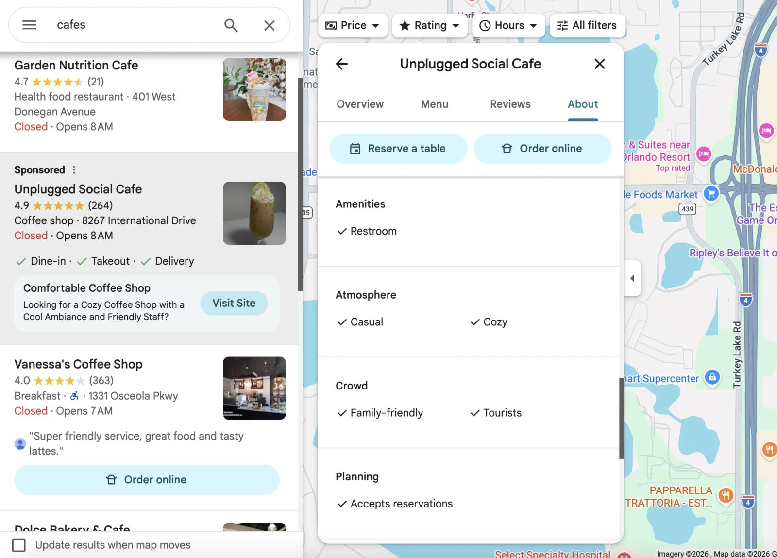
- “Can I work here?” is answered in seconds or they bounce
- Key signals = noise, seating, wifi, vibe
- Visual cues outperform paragraphs
- Content needs to behave like a filter, not a story
From paragraphs → structured signals
Reframed the experience into a modular, bento-style layout that surfaces decisions instantly.
- Bento grid for chunked information
- Text → visual components (badges, bars, tags)
- Grouped into “At a Glance”, “Vibe”, “Favorites”
- Decision-first hierarchy over storytelling
Faster decisions, more confident choices
The new structure aligns with how users actually evaluate cafes in real life.
- Key info understood in seconds
- Easier comparison across cafes
- Reduced reliance on long-form reading
- Feels curated, not overwhelming